Money Exchange Application:
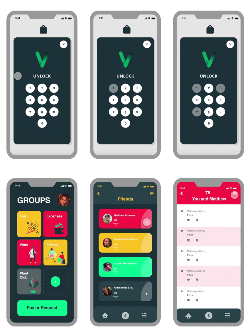
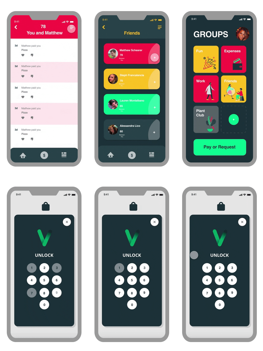
How might we enable mobile payment users to associate monetary transactions in a vibrant and youthful way?
Main Screens Look and Feel
The Problem
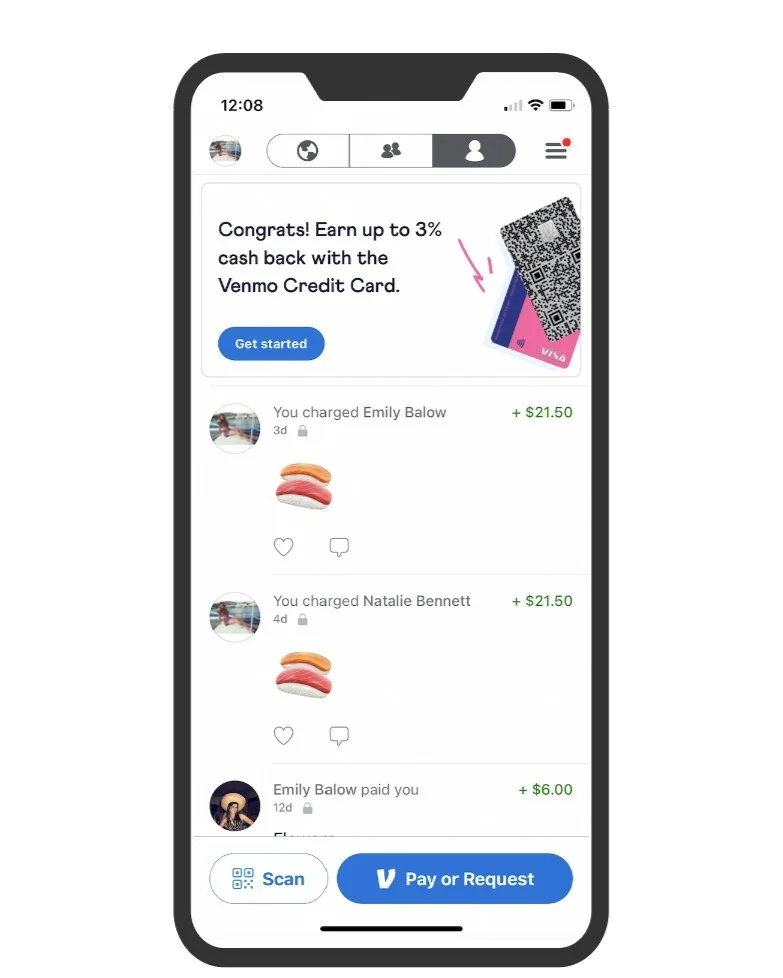
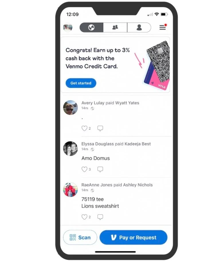
The traditional Venmo application infringes on ones privacy and maintains unconventional button placement. There is no way to avoid viewing the transactions of unknown people upon opening the Venmo application. Venmo’s unconventional button placement can be time consuming as the user must navigate through several pages to complete one task.
“Hodge Podge” Friend List
Disorganized page of all the transactions between you and your friends. How do you accessibly see your interactions between you and one other person?
Lack of Privacy
This page was concerning because you can see monetary interactions between random people! This page has nothing to do with user. There is no easy way to discover YOUR personal interactions.
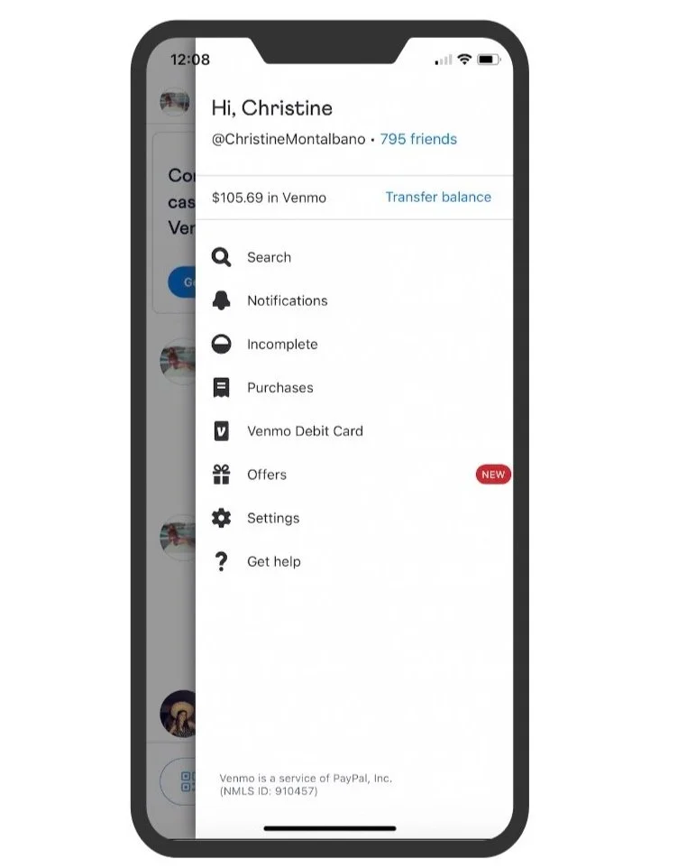
Unconventional menu bar
The placement of the menu bar is a bit unexpected. From this page the user still cannot discover their monetary interactions.
Initial Thoughts and Research
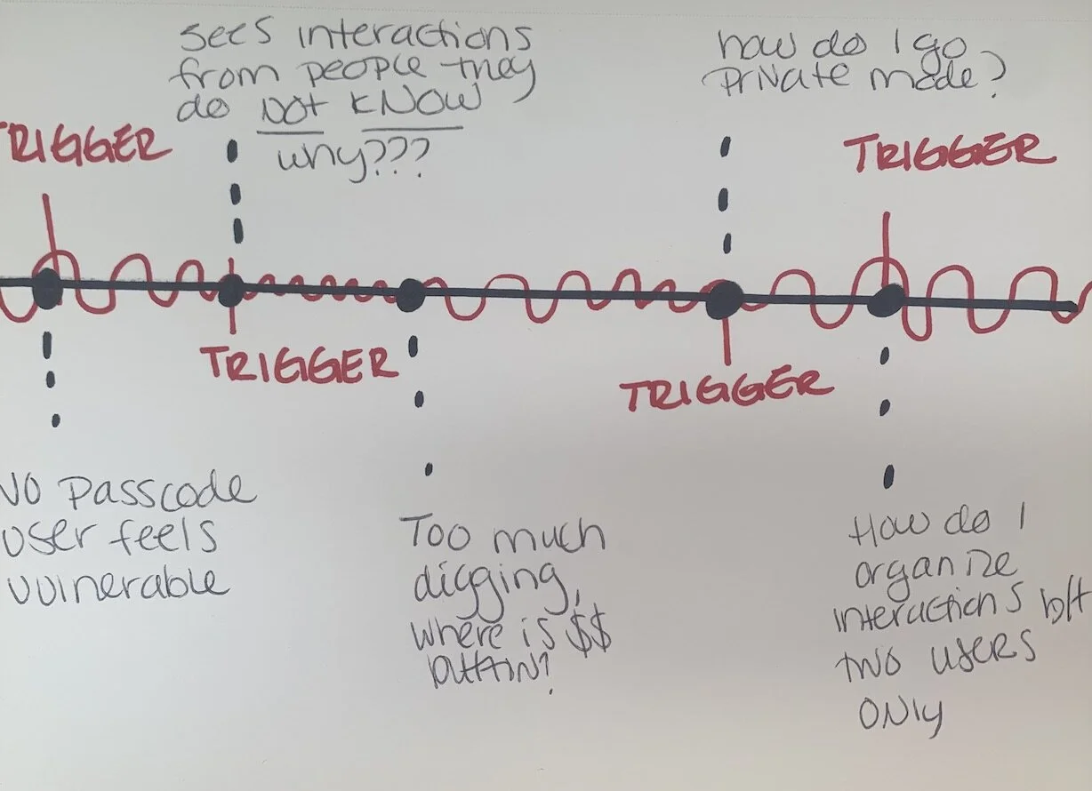
I had a month to explore and research different ways to make monetary exchanges digestible and approachable to a younger demographic. I started by researching what else has been done to understand how familiar users are with mobile payment applications. I asked questions like: Would users spend more time on money exchange applications if the experience was more private? How do you quickly navigate the application without digging through several screen?
Venmo users want to see personal transactions. When they check their bill at end of month, are they able to easily identify exactly who, when and what they “Venmoed” someone?
Venmo users want their transactions to be private. Why can they view random users transactions? Who can view my transactions? Many Venmo users get lost trying to find private mode.
Venmo users want to verify their payment is going to the correct user. Just searching a persons name does not assure that you know the person you are paying.
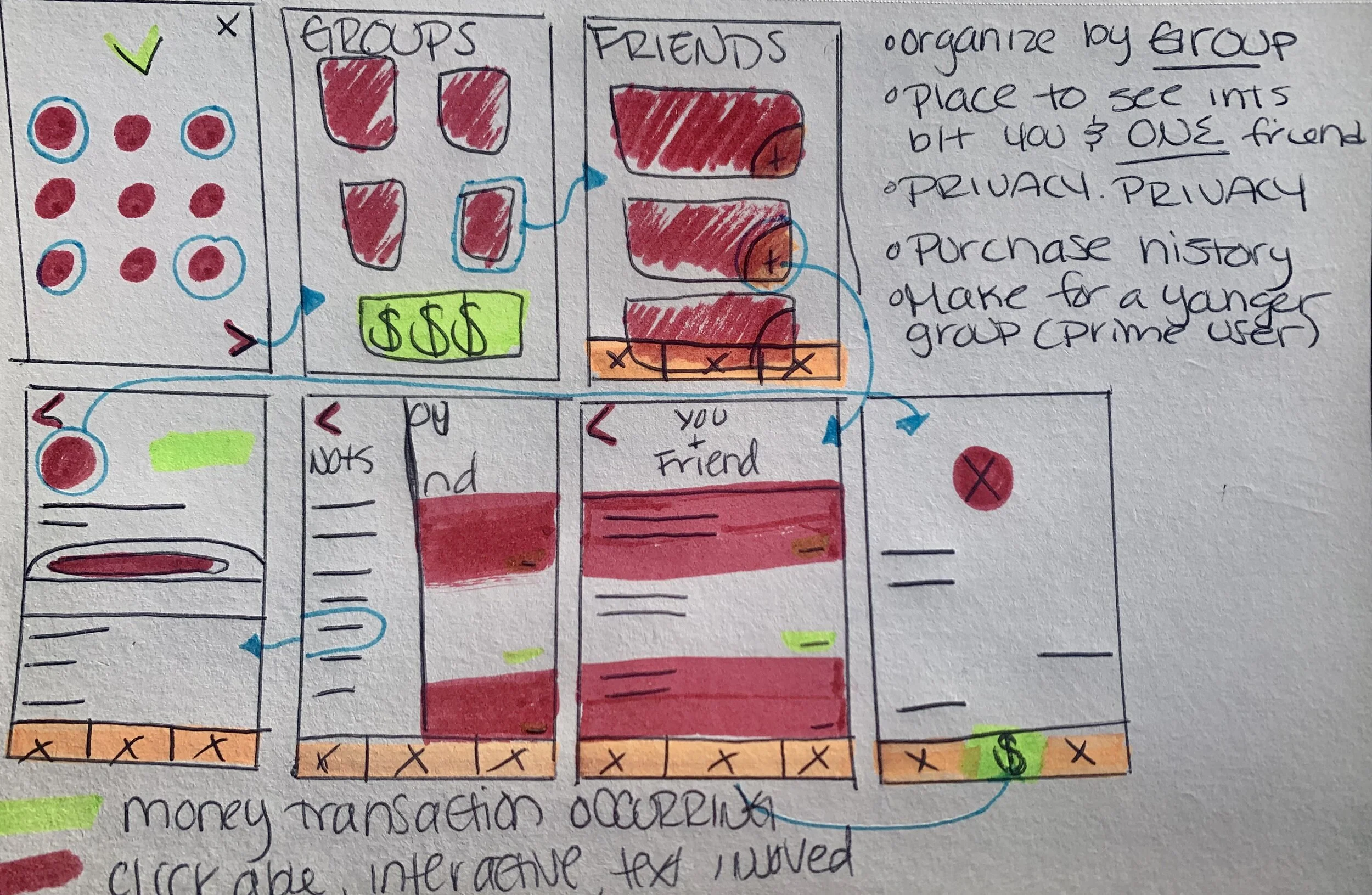
I learned that the intended users want to feel more confident and swift in their transactions, while mitigating the boring stigma behind monetary applications. This is a low-fidelity prototype I worked on to showcase how all these might work together:
Process: Mapping Out Wireframes
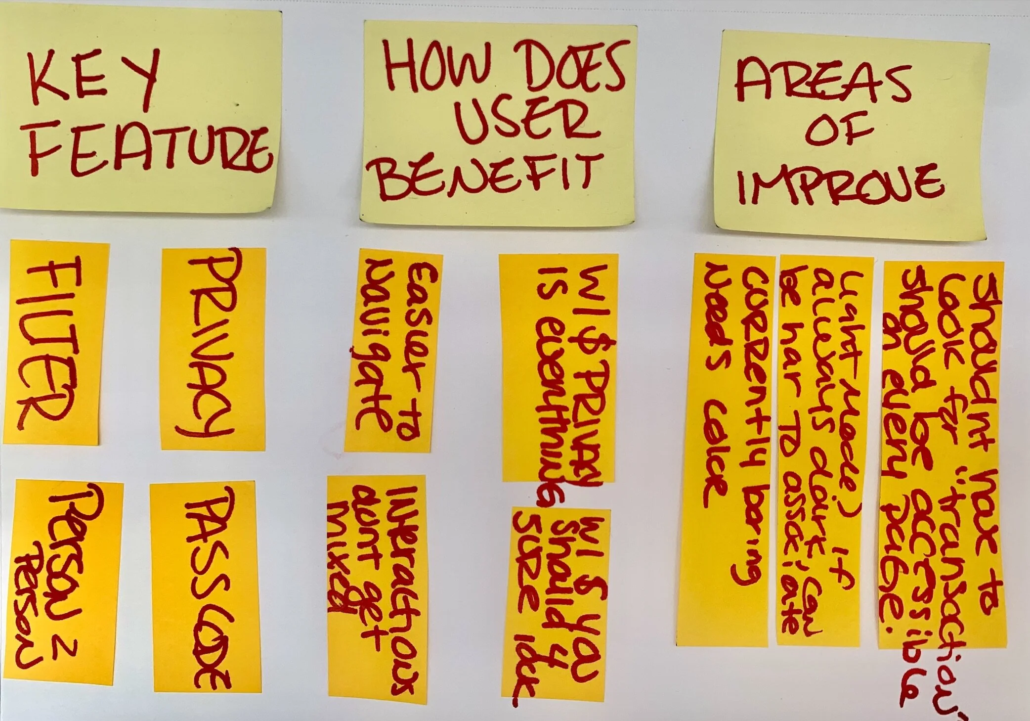
Information based on feedback from interviewees


